Simple Dungeon
A downloadable game
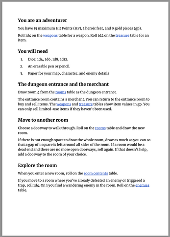
Simple Dungeon is a solo pen-and-paper dungeon crawl.
This game has:
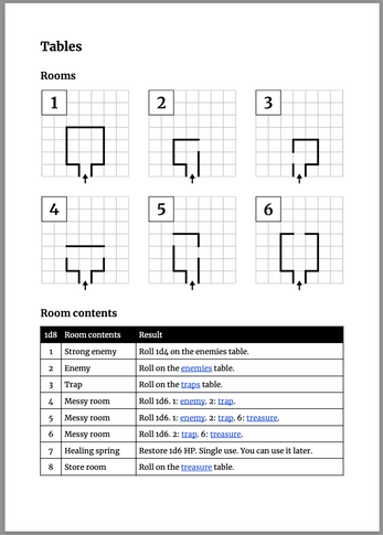
- Draw your own map based on pre-defined dungeon "pieces"
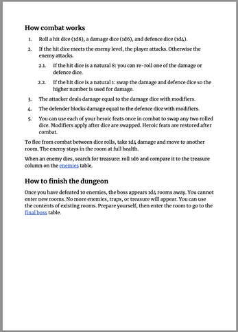
- Simple-but-strategic combat where the roll decides whether you attack or are attacked.
- Heroic feats, which let you swap rolled dice to turn combat in your favour.
- A boss enemy that appears at the end of the game.
- A merchant you can buy and sell items from.
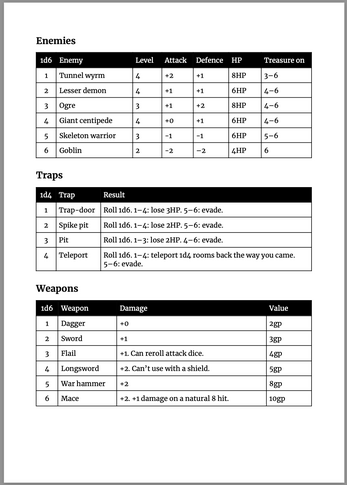
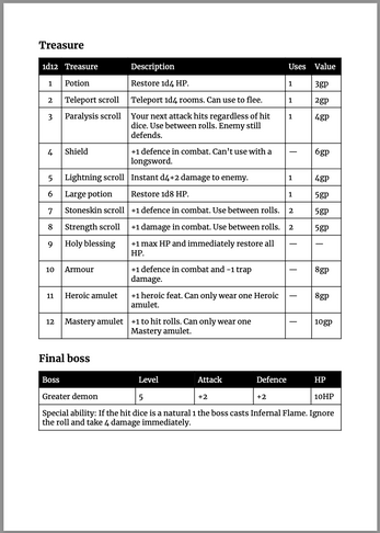
There are 2 pages of rules and 3 pages of look-up tables for dungeon rooms, enemies, traps, weapons, and treasure.
| Status | Released |
| Category | Physical game |
| Rating | Rated 5.0 out of 5 stars (2 total ratings) |
| Author | Anthony Hobday |
| Tags | Dungeon Crawler, Fantasy, Singleplayer, Solo RPG, Tabletop role-playing game |
Download
Download
Simple Dungeon 1.5.pdf 136 kB
Development log
- Simple Dungeon 1.5Oct 22, 2024
- Updated to 1.4Apr 25, 2024
- Updated to 1.3Apr 04, 2024
- Updated to 1.2Apr 03, 2024
- Updated to 1.1Apr 03, 2024
- Play-testers requiredApr 02, 2024
Comments
Log in with itch.io to leave a comment.
[Crosspost from BGG]
I've just finished my first run. It was a good deal longer than I expected (a good 50 minutes, due to whiffing a lot in combat, and also including some fiddling about with mapping and looking for my dice). All in all it's a pretty good distillation of the "big" pen-and-paper dungeon crawls (like 4AD or D100 Dungeon), but I didn't find it any more engaging either. The combat mechanic is pretty clever, though. Between the heroic feat and consumables, there's plenty of decisions around (although I find the Stoneskin and Strength scrolls too much of a gamble; I should've sold them to upgrade my weapon). I died to the final boss (one room away from an unused healing spring). Next time, I'll get 'em ;)
The layout is unadorned but very clear (as it should be). And there are hyperlinks in the text! Something I sorely miss in a lot of procedural games...
I only have two gripes. First, my first run lasted a bit too long (I might need to change up my dice for that). Second, the resulting dungeon map looks really boring. In my RPGs, I prefer fairly eclectic dungeons (with lots of different ways to reach a particular room), but it's hard to procedurally generate in a simple manner. D100 Dungeon introduces a surprisingly soothing way to add spice to its also boring dungeon layout—by colour-coding the rooms (instantly making the final result visually more appealing).
Thanks for this thoughtful feedback. I’ll think about how to address some of this.
Love the game! Especially the combat system- so clever and qucik. Defenitely my fav 4 against darkness-like so far. Congrats !
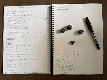
Thanks for this comment. It's made my day to see a photo of your play-through. My new game, Dungeons of Pendragon, uses the same combat system. But the next two games I'm designing use different combat systems. Hopefully they work just as well 😅
yeah, I'll be definitely trying Dungeons of Pendragon! The only feedback I have for Simple Dungeon is maybe instead of one or two messy rooms there could be sth more substantial like a special location (or even an extra table for such) .
This and even a little bit of asymmetry with heroes - like dwarf +2 to HP, elf stars with scroll, halfing- +1 to trap rolls. Would be cool! Nevertheless, I really do enjoy it and think I'm gonna go again today :)